

How to Design Using AI in 2026

Designing was hard. The era of vibe-coding, made the ability to build good designs super easy.
What was hard always was
TASTE.
I built 5+ projects using AI before I figured this out.
The answer never lied in better prompts.
It was that AI amplified the one skill which I ignored: developing taste.
Here's the workflow that clicked for me:
Execution Is Easy, Judgment Is Everything
You can ask Claude to "design a dashboard" and get something that works.
But does it look good? Does it even feel right?
AI excels at patterns it's seen. Your job is knowing which patterns are worth copying.
The designers who I see excelling in 2026 aren't the ones with the longest prompts or the newest tools.
They are more often the ones who've trained their eye by
Think about it: when you see a beautifully spaced landing page or a perfectly balanced color palette.
You're not impressed by the technical execution.
You're impressed by the taste behind it.
AI can execute anything. You just need to know what's worth executing.
Build Taste → Generate → Iterate
Here's the exact process I use now, broken into 5 steps that actually work together:
Moodboarding is peak 2010s, but it works perfectly for vibe design in 2026.
Before I touch any AI tool, I spend 20-30 minutes gathering screenshots of interfaces which are not just "pretty" designs rather interfaces that solve the same problem I'm working on.
Where to look:
Pro tip: Don't just save random pretty images. Ask yourself: "What specifically works here?" Is it the hierarchy? The spacing? The color restraint? Try naming it as this builds your design vocabulary.
2. Video → Code: The Kimi K2.5 Shortcut
You can literally record a video of any website you like and have AI recreate the code.
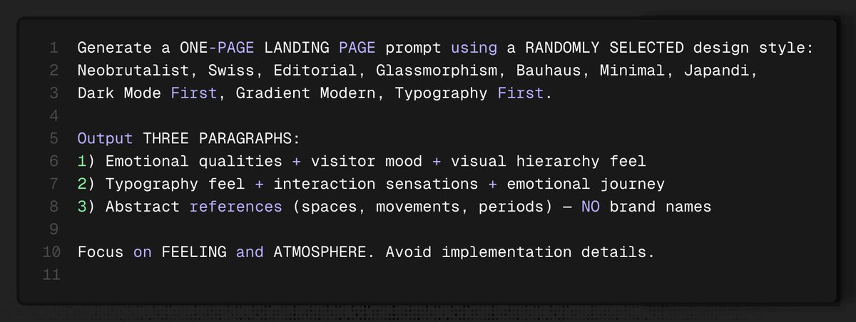
Here is the prompt i use to Reverse engineer screen recordings to landing pages:

Key points:
3. Learn the Language of Design
I struggled to make sense of anything till I understood the exact terms
You can't prompt what you can't name
Before generating anything, learn these terms so you can give AI precise instructions
instead of garbage requests like "make this prettier fam" or the best one "please".
a) Typography basics:
b) Layout fundamentals:
c) Color system:
Here is why this matters: When you say "reduce the leading on H2s to 1.4" AI executes perfectly.
The difference is precision. AI doesn't guess what "better" means.
But it knows exactly what "increase white space between sections from 32px to 48px" means.
4. Meta-Prompts + Skills: Build Once, Use Forever
Meta-prompts create range.
Skills lock in quality.
I prefer to use both.
I would suggest to take a look at the original prompt posted on Reddit by user JCodesMore on r/PromptEngineering
This would help to optimise the prompt for your use case
Then paste the style brief into Minimax-2.5 ( my current favourite model for front-end design). This is subjective for everyone :)
Outcome: you can produce dozens of distinct “vibe specs” quickly.
Volume builds taste.
My Current 3 favourite skills
1) UI Skills (made by @Ibelick )
A library of reusable “fix packs” for agent-built UI: accessibility, motion performance, metadata hygiene, etc.
Role: prevent common mistakes by default.
2) UI/UX Pro Max - Design Intelligence
A searchable design playbook for web + mobile.
You can literally pick up a stack and get recommendations for it
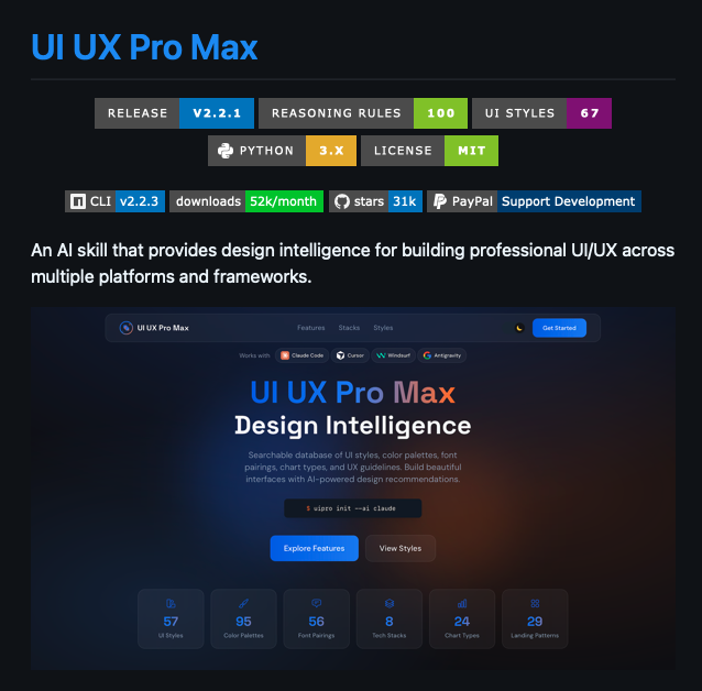
Install it using

3) RAMS : final QA with line-level fixes
Automated review that flags UI issues and returns concrete fixes (often with line numbers).
Role: last-mile polish before you ship.
Workflow I follow
Why this compounds: once your constraints live as skills, every future UI inherits them by default which mean less rework, fewer regressions and more consistent taste.
5. The Zoom-In Method: 50% → 99% → 100%
This is the framework that changed everything for me. Stop expecting AI to nail it in one shot.
Give AI everything you know about the project:

2. Second pass: Self-Review (99%)
Use this prompt for the AI to self-reflect
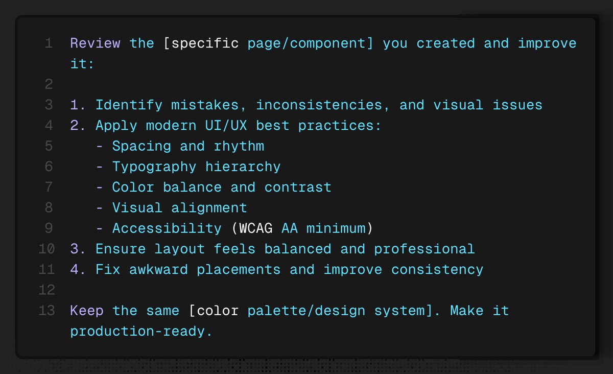
AI catches 70% of its own mistakes when you make it review its work.
Font sizes, padding inconsistencies, hierarchy issues ; it fixes them without you pointing them out.
Repeat this for each page.
You're now at 99%.
3. Micro pass (100%): Pixel-perfect polish
This is the final nail in the coffin.

Being specific = better results. Screenshots help even more.
The Philosophy: AI as Your Junior Designer
In this workflow, you stop treating AI like a "black box" and start treating it like a junior designer.
Professional design is a progression from low-fidelity wireframes to high-fidelity mockups, ending with polished micro-interactions.
The Zoom-In Method allows you to guide the tool through this proven process.
The New Design Moat
Your taste and process are your true competitive advantages.
The Bottom Line: You are no longer the bottleneck of your own creativity.
Stop overthinking and start shipping.
Before you generate anything, learn these terms. This is the difference between getting exactly what you want and getting random garbage.
Typography basics:
Layout fundamentals:
Color system: